When it comes to subscription ecommerce, we know a thing or two about clear design and user experience. The biggest challenge we face is applying unique branding and tailoring subscription to the nuanced subscription mechanic of that brand.
Below are 5 examples of D2C brands we have worked on with different subscription designs. Each of these brands came to us with clear brand guidelines but different degrees of customisation. All of these subscription examples use Shopify and Recharge.
Surreal Cereal
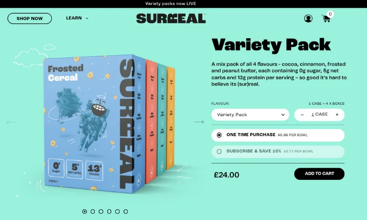
Surreal is new healthy cereal brand that promises to bring a bowlful of fun without high sugar. We were tasked with helping finesse the subscription flow and design. The challenge was to strengthen the user experience without removing the fun and playful aspects of the brand.
Information hierarchy was key to driving conversion, while also providing all of the necessary content about nutrition, case quantities, subscription mechanic and flavours.
Lovebug Petfood
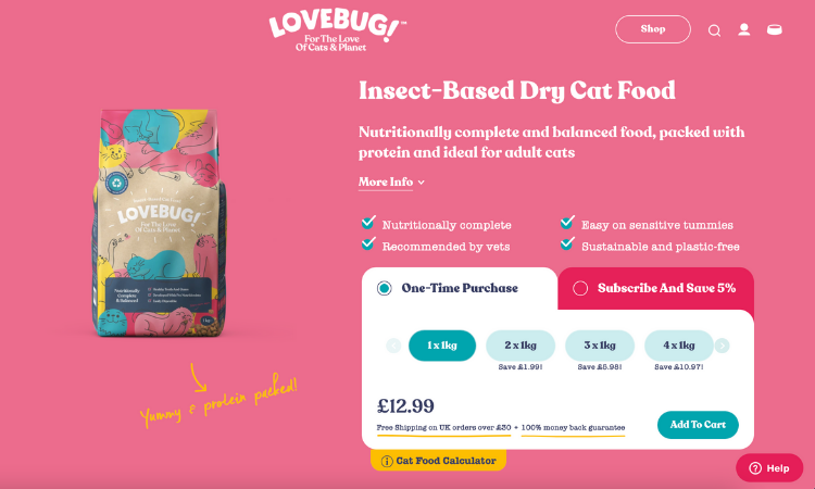
Lovebug is an innovative cat food that provides a sustainable, nutritionally complete biscuits through insect-protein. This Mars petcare brand not only had an innovative formula but an interesting proposition with subscription discount and bundle discount. They approached the Tribe team to help visualise this more clearly.
We found that by changing the mobile and desktop subscription block to a tabbed layout, helped increase conversion rate significantly. We also designed and developed a custom cat food calculator to help determine the correct quantity for subscription.
Hu Chocolate
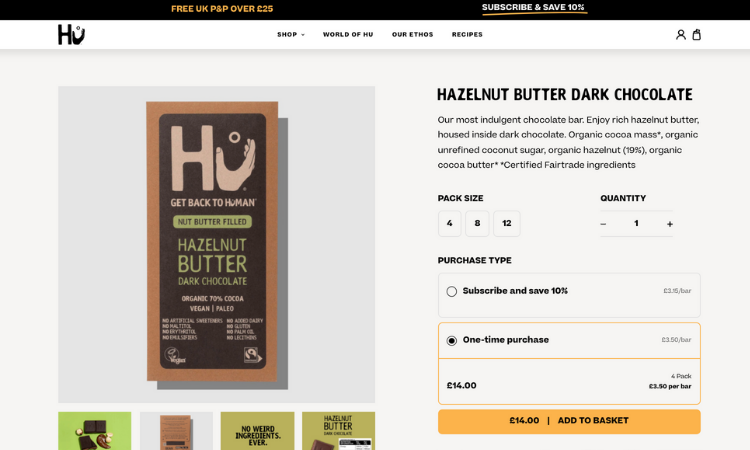
Hu is a Mondalez brand that delivers delicious vegan chocolate, and wanted to bring their products to the UK after success in the US. The chocolate bars are sold in packs of multiples, with discount incentives for purchasing higher quantities or subscribing, so it was important to give consumers a clear insight into these savings. We streamlined the design to allow consumers a clear view of the choices they have and used radio buttons for the purchase type.
Roam Personal Care
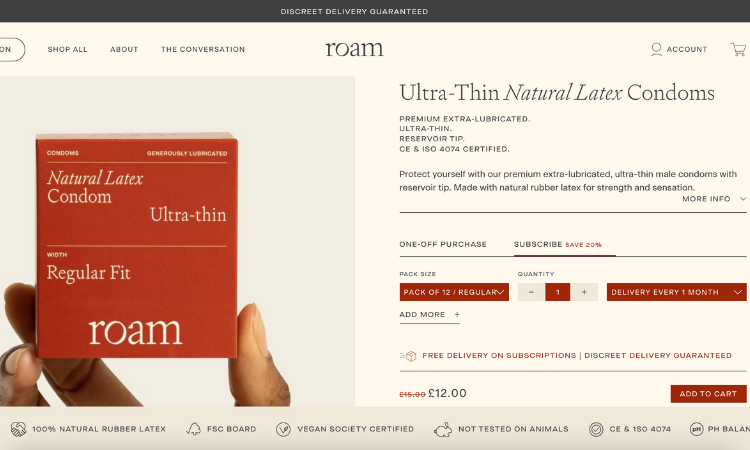
This disruptive sex care brand came to us with a clear vision of their brand identity and with the aim to make buying sex care an experience not to be embarrassed by. Keeping a premium visual identity was essential to build trust for this new product range and our subscription design had to pack a lot of information into a limited space.
This solution involved a Free Trial and personalised diagnostic tool to help deliver your subscription recommendations. While a complicated technical feat, we were able to maintain the editorial aesthetic that the brand wanted.
WholeSupp
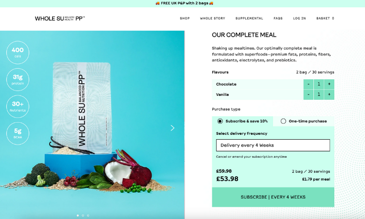
This plastic-free, sustainable alternative to Huel wanted to offer a one-stop whole food solution for health conscious consumers. The complicated elements to this subscription execution were the individual price points for different servings and discounts. There is also an Euro subdomain to facilitate international orders.
We were tasked to fit both flavours onto the same page, as well as highlight the high amount of nutritional.
This project was also interesting because it was our first editable cart. Meaning, you could edit or toggle your subscription in the cart fly-out module.
The examples above demonstrate just how differently subscription can be presented visually. If you’re looking for help with how to communicate your subscription mechanic, don’t hesitate to get in touch.
Design
Inspiring behaviour change through visual experiences. Our digital design services ensure instant clarity and visuals that cut-through in a cluttered market.


