

In the context of websites, designers and developers can’t really exist without the other. Two sides to the same coin, right?
Traits from these two specialisms may differ, but both disciplines are ultimately working as part of the same team with one main goal – to execute a beautiful online experience which demonstrates their skills in the best way. There is often the misconception that it’s more of an ‘us vs them’ relationship, than a harmonious match but they can both learn alot from working together and here’s a few tips from both sides to keep the relationship running smoothly.
Three considerations for a designer working with a developer
Platform limitations
The first thing that needs to be understood are the limitations of the system that the developer is using to make a project. Not all systems that developers use are the same, some have more limitations than others. For example, Shopify is relatively more limited in what it allows you to attach data to, whereas WordPress allows you to attach data to nearly everything that you want. Typically this doesn’t negatively affect the business owner but you will need to keep this in mind when developing certain sections of a website. While some layouts or functionality may look simple and easy to implement, the data still needs to be stored somewhere.
Responsive design
The second aspect that you need to keep in mind is that websites aren’t a static affair, instead they are rather dynamic. Unlike print media, where the size of the media is fixed, websites need to be displayed at a range of different screen sizes depending on what device it is being displayed on. A site that looks perfect on a larger desktop monitor but looks really cramped up on a mobile screen, and sites that look fine on a mobile device might stretch out on a desktop computer. You also need to be careful when trying to fill empty space because unlike with print, where you can just put a graphical element or text in some empty space and call it a day, every element on a website will affect the positioning of the elements around it. In our experience, designers love to add a visual detail to break up the layout of text, but even if something is positioned correctly on the page of a specific size, it could cover up important information on another page.
Most designers now work in a mobile-first manner, however it’s really important to think about the in-between screen sizes and ensure that the designs are flexible enough to adapt.
Mindful of aesthetics
The third point we would like to remind designers is to keep the number of colours, quantity of fonts, font sizes, and the like, as small as possible. If you are using a lot of different colour and font combinations for text and buttons across the site then it makes it more difficult for the developer to make reusable components that can be easily maintained or changed by the user.
Three considerations for a developers working with designers
It’s all about the details
Designers are naturally detail oriented and we know developers are this way inclined as well. The problem is that either party are looking at different sides of the same task. Whilst a designer may focus wholeheartedly on the smallest of visual details, a developer may have a tendency to wash over these gems to get to the crux of the site functionality and usability. Details such as spacing can get lost amongst the build process with pixels lost here and there. An added challenge is that some font files simply don’t render on a browser like they do in design prototype tools such as XD or Figma. Knowing how important these details are to the general aesthetic of a website and how easily they can be missed is something that every developer can benefit from.
Tell us the ‘why’ when it’s technically not possible
Designers work best when we have the freedom to explore solutions, so we love to know the reasons why something can’t be achieved, or won’t look like we expect. If you explain a basic summary we can go away and explore other possibilities to achieve the visual style or functionality that we want to achieve. This is especially useful early on in the project when we show you our initial designs, so that we can show our client something that we know can be achieved within the scope. If you have any suggestions we’d love to hear them!
Share the third-party updates
There is an endless list of apps, integrations, plug-ins and software utilised by both designers and developers, all constantly changing and improving. Each team needs to be on track with the latest updates and it’s essential to keep everyone in the know. If an update arises which you think may affect the design team, fill them in. It’s so important to keep an open dialogue on these things. The same goes for design tool updates and new features. If you see or hear of something new and innovative which you think could be inspiration for a designer, share it. Designers love to be inspired, they get really excited over the most subtle UI flourishes. They’ll keep you on your toes, asking if and when you can develop something similar, but this is what keeps everyone learning and skillsets growing.
We hope the above has helped give developers an insight to designers and designers an insight to developers! If you have any questions or want to learn more about specific design disciplines such as UX/UI, Shopify or subscription ecommerce, just follow us on instagram or linkedin.
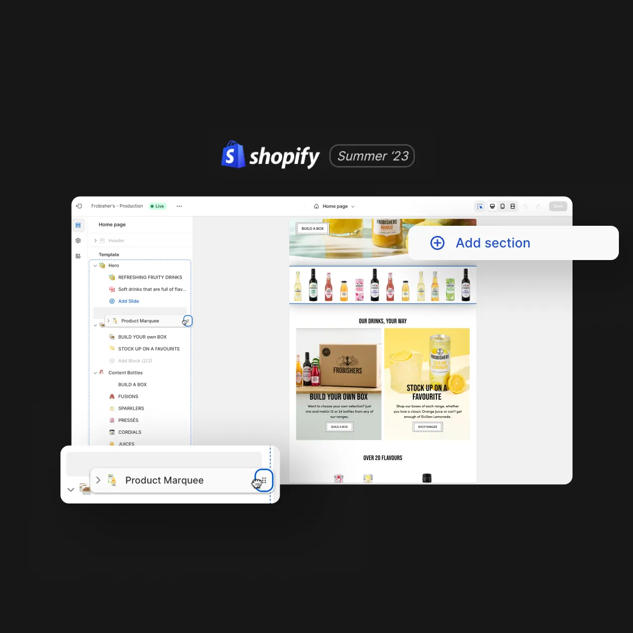
Shopify Decoded: Should you upgrade to 2.0?
Added 06.10.23
Shopify Decoded: Should you upgrade to 2.0?
Added 06.10.23
Shopify Decoded: Understanding Shopify Sections
Added 29.09.23
Shopify Decoded: Understanding Shopify Sections
Added 29.09.23
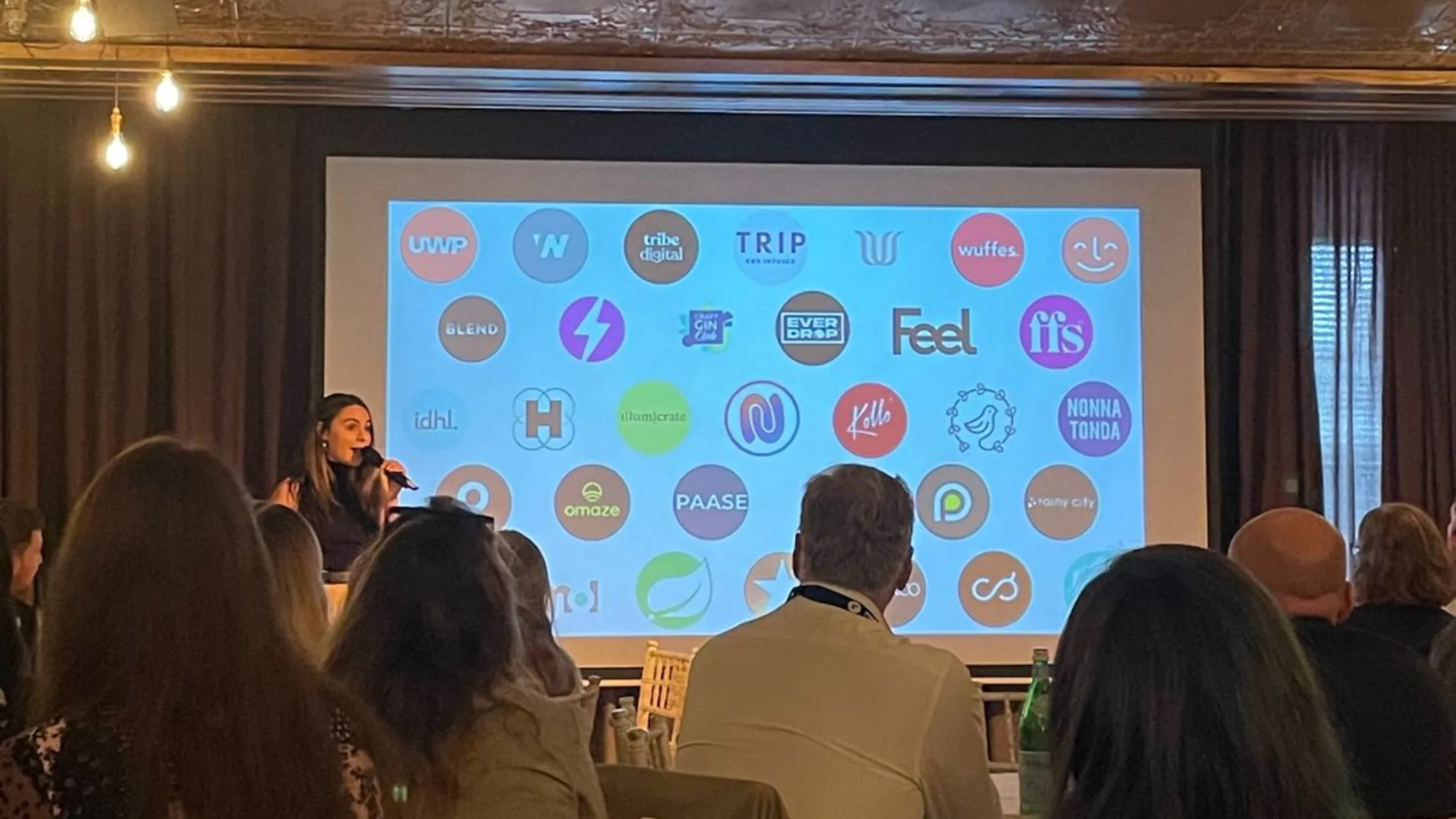
Recharge’s ChargeUp London 2023 Event
Added 27.09.23
Recharge’s ChargeUp London 2023 Event
Added 27.09.23
Design
Inspiring behaviour change through visual experiences. Our digital design services ensure instant clarity and visuals that cut-through in a cluttered market.
Design
Inspiring behaviour change through visual experiences. Our digital design services ensure instant clarity and visuals that cut-through in a cluttered market.