


Why is it that some food and drink brands have websites that are full of personality, and others go down the conventional route? We’re often asked how to navigate the line between the two, so that we ensure a slick customer experience without looking like every other site. In this article, we explore the question ‘is an experiential or conventional site better for your brand?’ and some of the best examples of these different approaches and break down why they matter. Whether you’re looking for a website that is fun and engaging, or informative and to the point, we can help you find the right design approach for your food brand.
First things first – What is the primary focus of your website?
There are different website design approaches, each of which can help reflect your brand personality in an effective way. The experiential website focuses on user interaction and engagement through features like scroll-triggered content or popups, while the conventional website uses more static layouts to guide users through the site in a straightforward way.
Most food and drink sites fall into two categories: direct-to-consumer or point of reference. Direct-to-consumer sites have grown enormously in the last few years, and are a fantastic way for brands to offer their product without relying on Amazon or listings in supermarkets. Point of reference sites mainly include brands that are already found in shops and have strong brand recognition. For these brands the website focus should be on communicating their brand story and as a PR tool.
How can website design encompass my brand personality?
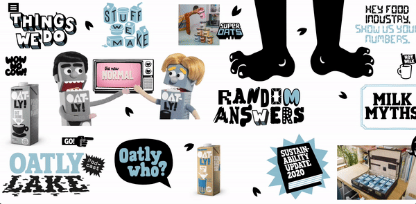
Oatly is well known for their witty copy and amusing illustrations throughout their packaging and advertising, and their website extends this brilliantly. Their unexpected website is a horizontally scrolling page filled with clickable elements. The role of this site is to encourage exploration and conversation, which is in line with the bigger picture of the brand.
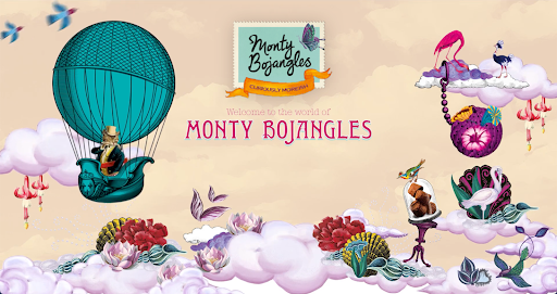
Another example is Monty Bojangles, they’re known for their quirky packaging and indulgent chocolates, and they are already found in major supermarkets. A standard website would feel inappropriate for such a characterful brand, so they’ve captured their personality within their site.
Colour is painted onto the page as the site loads, and the homepage is filled with illustrations and animations. Unlike Oatly they do have a clear way to purchase their products, but by adding products to a ‘trunk’ the whimsical feel of the brand is continued through the experience. Without clear navigation or product information the site could frustrate some users, but they’ve chosen to focus on an unusual experience.
How can a conventional website still convey my brand language?
If your site is the main path to purchase for your consumers, your approach should be very different. There needs to be a very clear call to action, and it is important that new customers landing on your site can easily navigate it. Learning from the product category is crucial, as you want to structure your site in a more conventional way.
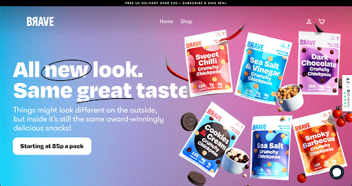
Snack brand Brave has chosen a site structure that is typical for ecommerce brands. Their character comes through using images that are full of colour and personality, illustrated icons, and scrolling banners.
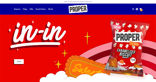
Although Propercorn are widely distributed, they’ve opted for a site that focuses on D2C sales. The site uses bold colours and illustrations as part of an easy to navigate site. As the brand is stocked in many supermarkets this could be a missed opportunity to create a site that goes beyond direct sales and fulfils a larger goal to inspire brand connection and loyalty.
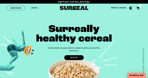
Is it possible to have a site that has brand character and a D2C focus?
A D2C focussed website is essential for many new food and drink launches, but does that mean you have to forgo any unique elements or storytelling? At Tribe we know how to balance these two things successfully. We worked with Surreal on a UX project, evaluating their site and making recommendations that resulted in a site that is bursting with character and interesting features, while creating a fluid user experience. The user journey was considered from the start, resulting in clear call to actions and navigation across the site. We utilised the brand photography and illustrations to bring quirkiness to each element of the homepage. This allows lots of personality to come through, without disrupting the user experience.
You can now see how being clear on the focus on your website can steer the direction you should take. For an experiential site, lean into your brand personality and story to delight your consumer, and don’t worry about breaking conventions. If your goal is D2C sales, start by learning from the product category and understanding your user journey, using imagery and motion to bring your site to life. To create a site that balances both, it is still very important to begin with the user journey and clear navigation, but instead of following all conventions, choose where to inject personality.
What are some key website design elements I should consider?
Some important website design elements to consider for your food brand website include:
- Layout: How you arrange the content on your website can have a big impact on how users engage with it. For example, using a simple layout that features clear calls-to-action can help guide website visitors down the conversion funnel, while using a more experiential approach may be better suited to providing an engaging user experience.
- Content: The content you include on your website will depend on your brand story and the type of website you’re looking to create. If you want to focus on selling product, then you’ll need clear and concise product descriptions. On the other hand, if you’re looking to create a website that tells your brand story, then you’ll need to include content that is engaging and evokes emotion.
- Visuals: The images you use on your website are vital for creating an effective user experience, so whether you choose high-impact visuals or more subtle design elements is up to you. Just be sure to choose images that support the content on your website in a cohesive way.
If you’re looking to create a website that truly reflects your food brand, then it’s important to consider all of these website design elements and how they can help you achieve your goals. From layout to content, visuals to ux/ui design, there are many factors that can help your website stand out from the crowd. So which approach will work best for you?
If you’re looking for help with your D2C project, from Shopify SEO to subscription integrations or growth marketing, we’re happy to help.
Shopify Decoded: Should you upgrade to 2.0?
Added 06.10.23
Shopify Decoded: Should you upgrade to 2.0?
Added 06.10.23
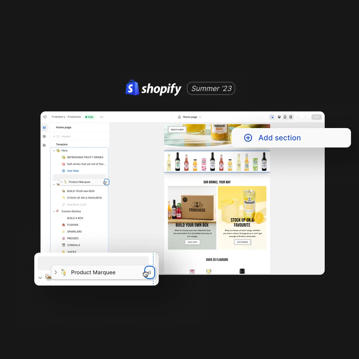
Shopify Decoded: Understanding Shopify Sections
Added 29.09.23
Shopify Decoded: Understanding Shopify Sections
Added 29.09.23
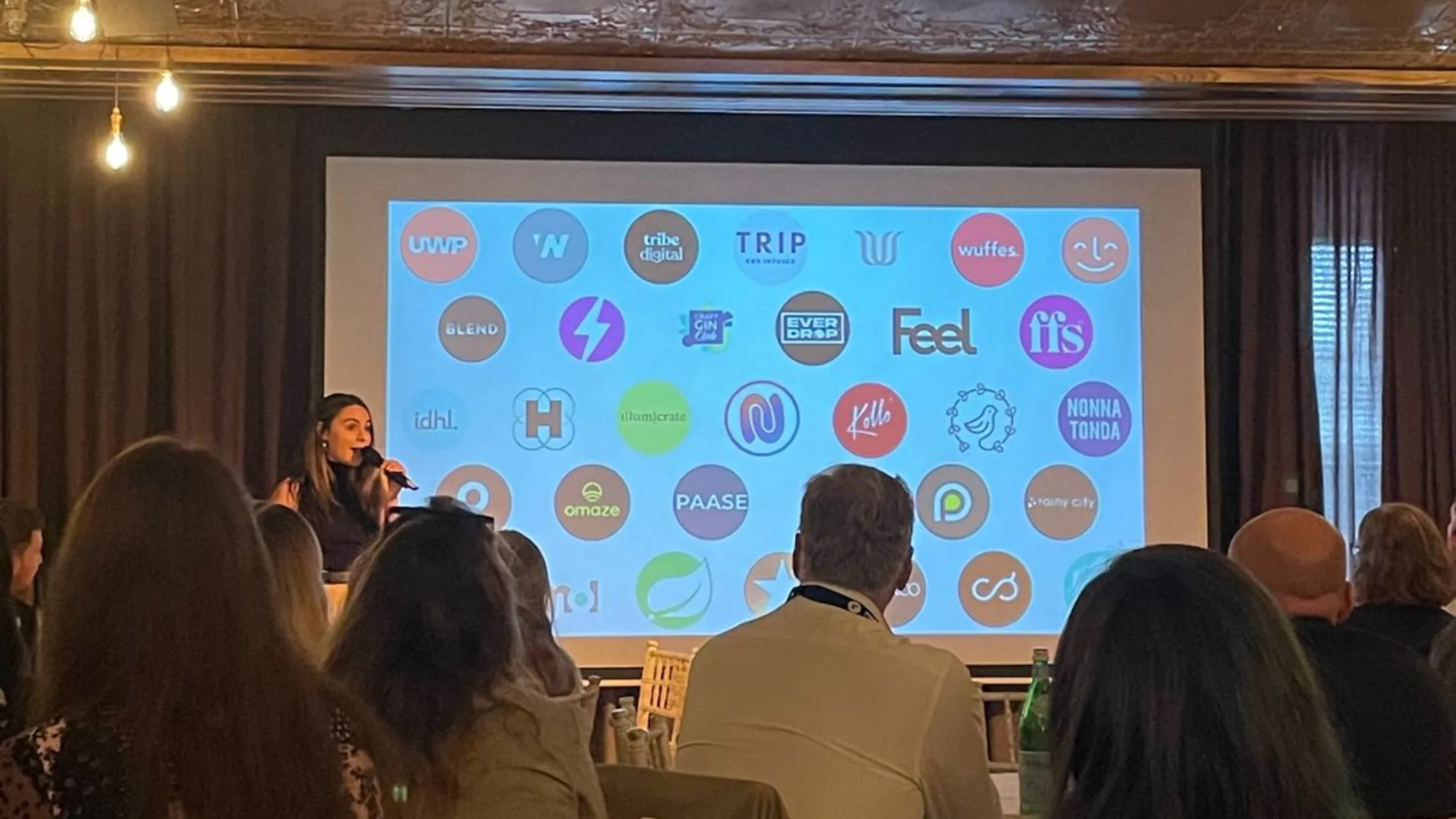
Recharge’s ChargeUp London 2023 Event
Added 27.09.23
Recharge’s ChargeUp London 2023 Event
Added 27.09.23
Design
Inspiring behaviour change through visual experiences. Our digital design services ensure instant clarity and visuals that cut-through in a cluttered market.
Design
Inspiring behaviour change through visual experiences. Our digital design services ensure instant clarity and visuals that cut-through in a cluttered market.